
As I continue to learn, I want to see if anyone can answer why when looking at the graph on hypothetical growth for an index fund, why is it that in some funds the hypothetical growth line is right on top of the line of the index they follow and are only off by a few dollars (FNILX), whereas on other funds they follow the same pattern but are lower on the graph and are several hundred dollars less (FIPFX)?
Hi Shoobee!
I assume you mean a chart like this?
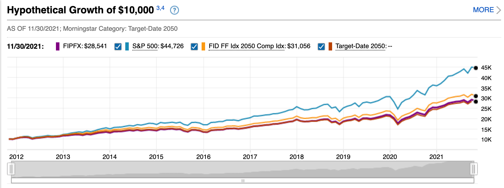
In the above image you can see the S&P 500 line way above the target date index fund line. The reason is, the target date index fund contains a blend of US, international, and bonds. Over the time period in this chart it just so happens that the large US stocks have outpaced those other asset classes. It’s tempting to assume that will be true for the NEXT 10 years too. But statistically that’s not true. What did best the last 10 years isn’t what’s likely to do best the next 10.
Does that answer your question? Basically, it’s not comparing apples to apples. It’s comparing apples to a mix of apples, oranges and grapes. The target date index fund contains the S&P 500 plus a bunch of other stuff. So it performs similarly but not exactly the same.